스타일시트 작성
posts.scss 파일에 아래와 같이 추가한다.
// devise 모든 뷰 파일에 포함되는 _links.erb 파일의 <a>를 블럭으로 표시함.
.devise-links {
a {
margin:.5em 0;
display:block;
// background-color: red;
}
}
// checkbox right margin -> 5px 로 지정함.
input.boolean {
margin-right:5px;
}
legend h2 {
font-weight: bold;
font-style: italic;
border-right: 10px solid #eaeaea;
border-left: 10px solid #eaeaea;
padding:0 .5em;
}
.alert-box {
margin-top: .5em;
}
a.close {
color:white !important;
}
#posts {
// padding:0 1em;
margin-bottom: 4em;
}
.post {
margin-bottom:2em;
.title {
}
.author {
text-align: right;
margin-bottom: 2.5em;
}
.content {
p {
line-height: 1.5em;
margin-bottom:.5em;
}
// margin-bottom:2em;
}
.actions {
}
}
그리고 custom.scss 파일을 생성하고 아래와 같이 작성한다.
.button {
@include button;
background-color: white;
color: #999999;
border:1px solid #cccccc;
}
.input small {
display:block !important;
text-align: right;
margin:5px 2px;
color: #ff0000 !important;
}
.tiny {
margin-bottom:0;
}
#blog-banner {
margin-bottom: 3em;
}
#footer {
text-align: center;
height:3em;
padding: 1em 0;
border-top:1px solid #eaeaea;
}
방근 전에 작성한 posts.scss와 custom.scss 파일을 application.scss 파일에 임포트하고 아래와 같이 media query 부분을 추가한다.
@import 'foundation_and_overrides';
@import 'foundation-icons';
@import 'custom';
@import 'posts';
@media only screen and (min-width: 64.063em) {
.large-9 {
padding-right:4em;
}
}
@media only screen and (min-width: 40.063em) and (max-width: 64.062em) {
.medium-9 {
padding-right: 2em;
}
}
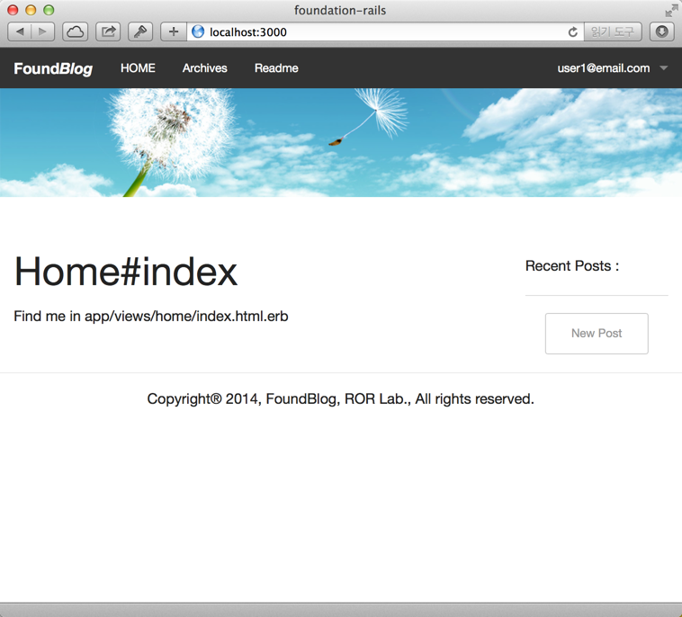
이제 이전보다 훨씬 깔끔하게 보일 것이다. 화면의 크기변화에 따라 페이지 레이아웃이 변화는 것을 확인한다.
지금까지 작업한 내용을 로컬 저장소로 커밋한다.
$ git add .
$ git commit -m "제05장 : 스타일시트 작성"
$ git tag "제05장"